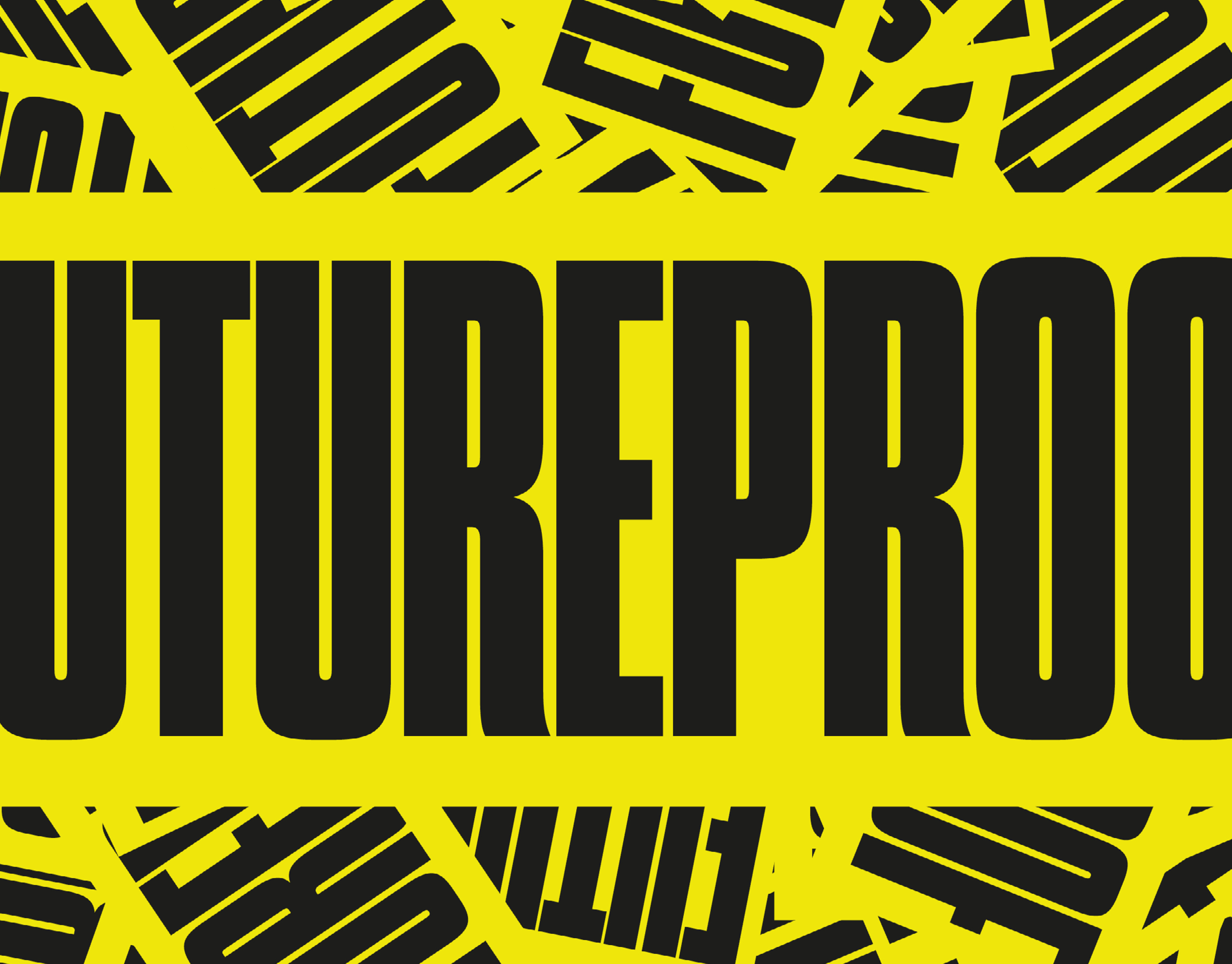
TEMPO is a student brief, which was to create a magazine related to the music industry, with a focus on typesetting and a strong type lockup. We were given the name of the magazine and the text, a few images of famous folk and blues artists, and a few headlines that would be featured in the magazine. The rest was up to us to stylise however we saw fit.
INITIAL WORK
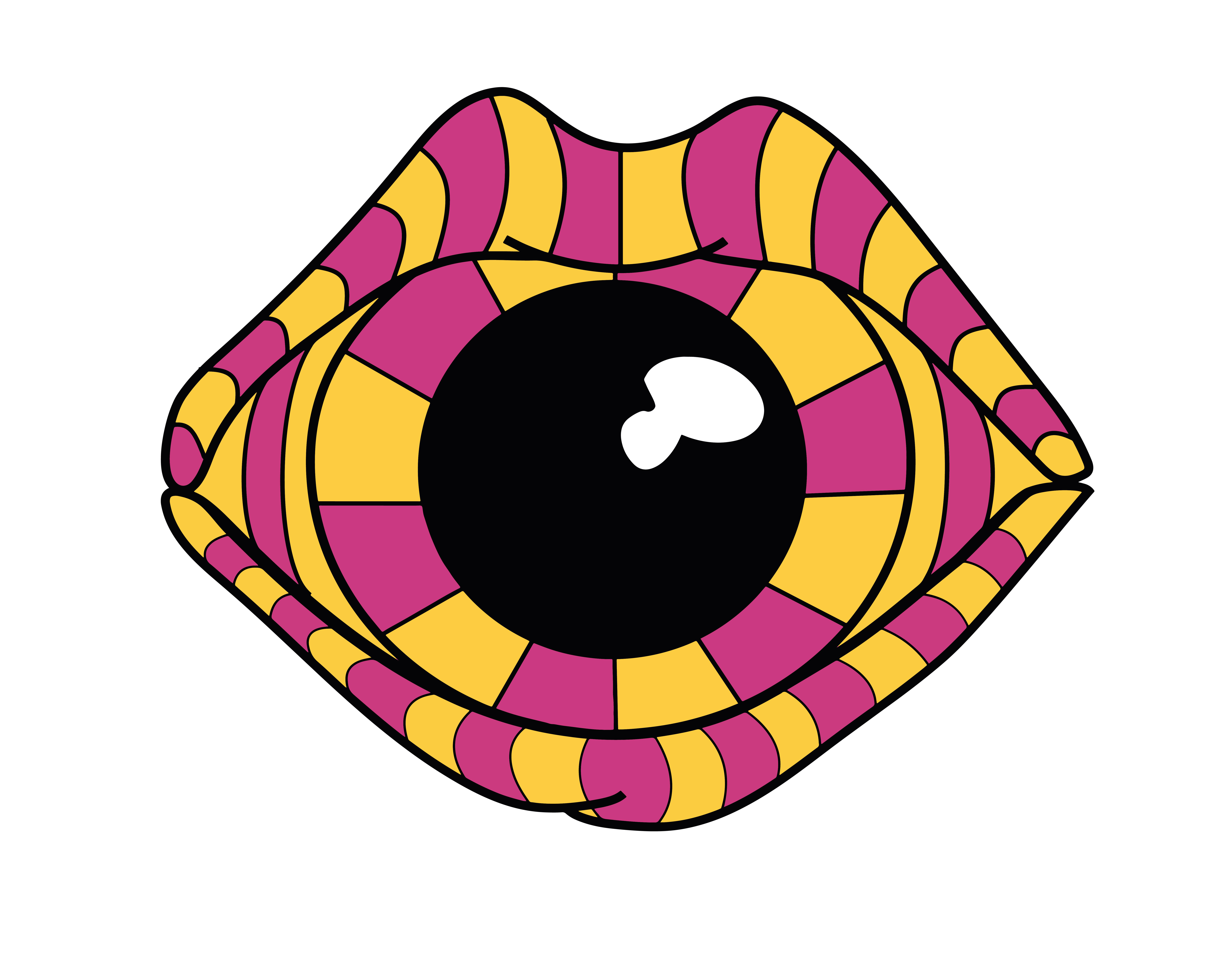
I initially created a cover that focused on a tagline surrounding the Kora, a harp-lute, and created my visual imagery with an emphasis on psychedelia. I did this as a collage, and decided to make the rest of the colour on the front page black and white so the main design ‘popped’.
FINAL PIECES
Upon revisiting, I decided a new approach. I went with a more simplistic layout would be more effective for the topics covered, and the direction I wanted to take the brief. I felt that with the ‘stripped back’ look, I would choose a font that was eye-catching enough so that the final composition didn’t look more of an information book than a magazine. For the main article, I followed this approach with the type lock-up and text. For the imagery, I used more negative space, removed/muted most of the backgrounds, and made the images black and white. This was partly to fit in with the theme of the editorial piece being about the past, but to also make the singers the focal point of what the reader was looking at.
QUEENS OF FOLK
'Queens of Folk' was the article name I chose for this brief. I decided to elongate the 'Q' and the leg of the 'N' to create some interaction between the words.
